People read shapes, not letters
While early street signs used all upper-case letters, nearly all modern street signs use a mixture of capital and lower-case letters (title case) that facilitates quick reading. When graphic designers Jock Kinneir and Margaret Calvert famously redesigned and standardized the British road signs in the early 1960s, their decision to move away from all capitalized letters drew criticism. But they were adamant in their decision. “The actual word shape was the most distinctive thing because if you had Birmingham in capitals, from a distance, it’s difficult to read but in caps and lower case you have word shape,” Calvert told the BBC. “That was fundamental.” 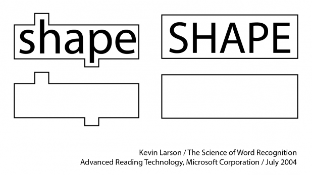 “The general idea is that we see words as a complete patterns rather than the sum of letter parts,” writes Kevin Larson for Microsoft in “The Science of Word Recognition.” Lower case letters have variable and distinctive forms that allow words to be read as distinct shapes, while words uniform and blocky upper case letters must be read letter-by-letter. Today, the U.S. Federal Highway Administration requires that all new road signs use title case to indicate place names and destinations.
Layer information with non-verbal cues
While the words on the sign often ultimately tell road users what to do and where to go, the color, shape and position of the sign expedite the communication process. “Color programs will distinguish signs from each other and can offer an indication of the message without having to be able to understand the language of the sign,” explains the Design Workplan. The colors of street signs can often indicate what type of street it is, or communicate to road crews who owns and pays for that street’s repair. Such is to say that most viewers can understand a complex set of information based on a limited set of indicators that combine verbal and non-verbal cues. Many road signs opt for pictograms over words whenever they can, both because they are instantly recognizable and because they reach across language and cultural barriers. In journalism the saying, “Show, don’t tell,” urges communicators to demonstrate their point rather than spelling it out for the audience. When trying to convey a message, especially on a sign where messages are often repeated, an illustration is often more effective than words. 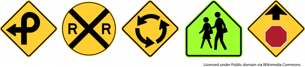
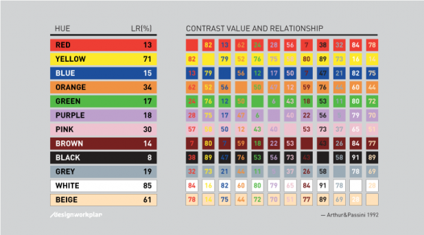
Embrace contrast, but not too much
While some text road signs use a simple black text on white background, the vast majority use white typography on a colored background. Beyond giving non-verbal cues as discussed above, these combinations also make for easier reading. The Design Workplan website has a fantastic guide to creating color combinations for signage in various location and for various purposes. They cite the 1992 Arthur & Passini book “Wayfinding,” which recommends calculating the difference in light reflectancy readings between two colors to determine contrast. Any two colors with a contrast value larger than 70 will definitely be legible.