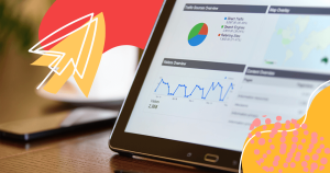
Do you use interactive data visualization to communicate with your market?
Using 2D or 3D content — diagrams, maps, plots, charts, motion graphics, videos, infographics, and timelines — decision-makers or common people can quickly and effectively comprehend the meaning of data becoming a data literacy professional —, able to identify trends and discover patterns.
90% of the information conveyed to the brain is visual and 65% of the population is composed of visual learners.
These stats reinforce that humans are visual creatures and because of that interactive data visualization provides the best results making it easy for audiences to understand and retain information.
Produced by specific tools, such as BI software, interactive data visualization content is essential to demonstrate data evolution or regression in historical series. Keep on reading and get to know more about:
- What are the interactions of data visualization?
- What are the benefits of interactive data visualization?
- How to use interactive data visualization in your company?
- What are the best examples of interactive data visualization?
What are the interactions of data visualization?
Data available and the project’s goals are determined to choose the type of interactive data visualization. We listed below some interactions that will help you to better explore your information.
- brushing controls content characteristics changes, such as colors, outlines, and specific points with a mouse pointer, getting closer to the region of the display and highlighting data in the current view. It can be used to focus specific visual patterns in one view, link to another one, and filter it out permanently for further analysis;
- painting is made with persistent and subsequent brush pointer procedures;
- scaling can change a plot’s aspect ratio, revealing complex data. While linear scale shapes – bars, or rectangles, for example -, are proportional to the data values, in logarithmic scale data values aren’t linearly spaced along the axis. So, scaling is commonly used to zoom in on dense regions of a scatter plot;
- identification helps users with automatic labels which appear when the cursor floats over a particular plot element.
- linking attaches selected elements on the graphics: a point in one corresponds exactly point in other. If you doing something in one graphic area will do all the same in the other corresponding area.

What are the benefits of interactive data visualization?
We like to see how everything progresses across time. Unfortunately, seeing linear data presented as a string of information does not meet our preferences, but interacting with data makes us better understand the story behind it.
Choosing the right data visualization type, you are communicating powerful insights and offering people the chance to see the information they haven’t seen or experienced before. For businesses, it is an opportunity to:
- make live-action decisions;
- spot market trends to gain an edge on competitors;
- expand reaches;
- find correlations and connections between processes;
- fight bottlenecks;
- make changes quickly;
- boost brand awareness;
- identify problems’ causes;
- make data compare from historical patterns;
- see relationships in different workflows.
How to use interactive data visualization in your company?
We have selected four ways for you to apply your knowledge of data in the business environment, check it out below.
Expense Reports
Data visualization allows you to discover spending trends in organizational cost reports to improve business profitability. Also, it helps to compare the expenses of the same cost center between departments: which sector spends the most printing inputs, for example.
Customer engagement trends
Marketing doesn’t work without data and you must create reports proving your boss that the amount invested in marketing strategies was positive. Using numbers of clicks and blog’s engagement rate, for example, interactive data visualization reports allow you to measure KPIs over a while and helps to compare the information obtained with revenue growth.
Hiring Reports
Many organizations decentralize their hiring process, don’t create a hiring persona, or establish an effective internal branding strategy. In addition, some recruiting tactics don’t work or result in less qualified candidates.
You can use data to centralize information, create a strategy, and have a recruitment process consistent with the company’s values. Through data, it is possible to know, for example, which social media channel generates more qualified candidates or reasons for a high turnover rate, which allows to you define talent retention methods.
Tech team performance reports
Imagine being able to real-time monitor your technical teams’ performance through interactive reports? This high level of information allows you to prevent system and machine downtime, schedule updates and maintenance, for example.
What are the best examples of interactive data visualization?
Now you’ll see some examples of the most beautiful interactive data visualization created by agencies, companies, artists, and journalists.
Codex Atlanticus

Codex Atlanticus won the 2019 Gold Kantar Information is Beautiful Award in the Art and Entertainment category. It is an interactive data visualization example of Visual Agency from Italy, which prepared the most beautiful – and largest – digital collection of Leonardo Da Vinci’s journals and notebooks.
Drowning in Plastic

This interactive data visualization by Reuters Graphics proves that human beings cannot dispose of plastic waste without thinking about recycling, showing the piles of plastic bottles concerning famous landmarks and scapes.
Starbucks Data Wall Experience

We know how relevant data visualization is to consumer experiences: it allows customers to know the products better – and, in this case – the company’s history. Using augmented reality, Starbucks Data Wall Experience by Accurat Agency, which won a Gold Kantar is Beautiful Award in 2019 for the unusual category, showed Starbucks’ customers from Milan different data layers about their history.
How to Dress for Space
Source: (https://www.washingtonpost.com/graphics/2019/business/immersive-space-suits-history-fashion-and-function/)
SpaceX recently launched the manned spacecraft Dragon Crew to the International Space Station (ISS). For space addicts, this interactive data visualization in The Washington Post shows detailed 3D visualizations of five space suits, from the first mercury, covered suits to the one-piece SpaceX suit.
Beautiful News Daily

This type of data visualization by David McCandless – the creator of the Kantar Information is Beautiful Awards and his team was made from the collection of 300+ datasets in different categories. The result tells us that information is beautiful.
The Year Hong Kong Dominated the Headlines

The Year Hong Kong Dominated the Headlines is a roundup of infographics and data visualizations published by South China Morning Post through the year and is about important topics like the US-China trade war and the Brexit.
The Room of Change

Data visualizations can be considered an art, but not everyone gets wonderful results like Giorgia Lupi, who exposed her project at the XXII International Exhibition of La Triennale di Milano in 2019.
Interactivity attracts the audience because it highlights data with elements such as actions and colors, data visualization for mobile is simple to understand, easing to share, and embedding.
Do you like these interactive data visualization examples? How about creating one for your company too? Get your creative services quote right now!

Start creating interactive content with Ion and increase your marketing results!
Start creating interactive content with Ion and increase your marketing results!

![[Rock NA] State of Marketing Reports 2024 – Comkt Hubspot State of Marketing Report 2024](https://rockcontent.com/wp-content/uploads/2022/07/Banner-Fino-Rock-Convert-2500-%C3%97-500-px-19.png)


![eCommerce Optimization Guide [with the best tips to boost your sales]](https://rockcontent.com/wp-content/uploads/2022/02/ecommerce-optimization-300x158.png)


